IMPACT
Moved complexity out of the UI and into system behaviour, so a workflow already low on trust could take on a bigger feature without asking more of its users.
I led a redesign of a core enterprise workflow for sales associates working with clients in real time, where mistakes carry direct financial risk. Following release, associates moved through the flow with greater confidence, and the business shipped the bigger feature without the errors or pushback the flow's fragile trust made likely.
THE PROBLEM
Associates could only add one item to a Collection at a time, and the business wanted multi-add, without increasing the cognitive load of a system users already didn't trust.
Associates selected items from a catalog and added them to Collections, curated lookbooks built for a specific client. Clients could add every item to their cart from one shared link. In the original flow, associates could already add a single item to multiple Collections at once. What they couldn't do was select more than one item at a time, the biggest source of friction in the flow. But trust in the tool was already fragile, so any fix had to feel like simplification, not something new to learn.
The original guardrail blocked re-adding a product already in a Collection, to protect existing size information. That worked when only one item moved at a time. Multi-add changed the shape of the problem: with several items selected together, some already sat in some of the target Collections, some with size information, some without, and the guardrail that once protected users became a bottleneck instead.
Before: Items could only be added one at a time.
Re-adding a product with a different size wasn't possible, so associates hit friction on cases the system should have handled.
It surfaced a second problem before the first was even solved: selecting a size on the product page updates inventory live, so once an item sat in the multi-add queue, changing its size created a real ambiguity.
Surfacing more information didn't help. It just made a stressed user reason through more of it.
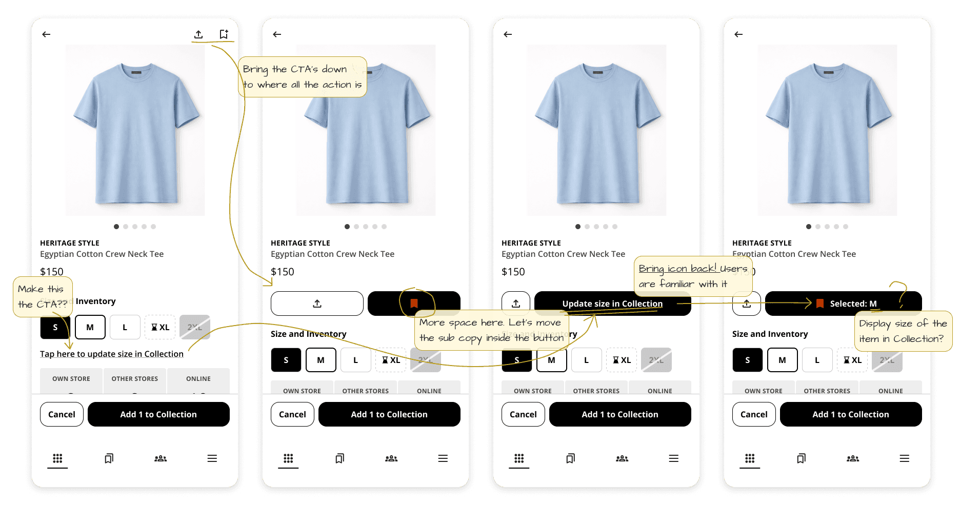
Was the associate checking inventory, or updating their selection?
Every attempt to surface more information just made the question harder to answer under pressure.
THE INSIGHT
The problem wasn't how to communicate complexity better. It was how to eliminate the need to reason about it at all.
Exposing every state, and adding confirmation steps, both just shifted the reasoning load back onto associates already working under pressure. Instead, I defined one rule the system would follow consistently, so nobody had to hold it in memory:
If no new size is selected, the system preserves the existing state
If a new size is selected, the system treats it as new intent and updates the Collection
The interaction became predictable from the associate's side. The complexity didn't disappear, it just stopped leaking into the UI.
After: multiple items can be added at once.
Re-adding a product updates it to the most recently selected size; leaving size unselected preserves what was already there.
HOW IT WORKED
Decided what the system needed to show, when it needed to show it, and what could safely stay implicit, then rebuilt the flow around it.
1. Made state visible at the moment of decision: co-located size selection with the Collection actions, with inline feedback confirming a size change the instant it happened.
2. Grouped by intent, not data structure: organized actions around what the associate was trying to do, cutting how much they had to hold in memory at once.
3. Left working patterns alone: kept familiar interactions where the system already worked, to avoid unnecessary relearning in an already low-trust environment.
Size selection and Collection actions now live in one place
Utilizing inline feedback to resolve the old ambiguity between checking inventory and updating a selection.
THE OUTCOME
Monthly revenue tied to this workflow, which had been averaging $50K, peaked at an unheard-of $345K during Black Friday.
Errors during live sales conversations dropped, and associates moved through the flow with more confidence, even as the system underneath grew more complex. The team lead overseeing the work attributed that Black Friday peak directly to this redesign. It also rebuilt enough trust to take on the customer-facing side of the same workflow next: the experience clients saw when associates shared a Collection with them.
REFLECTION
In low-trust systems, clarity comes from predictable behaviour, not from better explanation.
Adding more information doesn't restore confidence once it's gone. Defining behavior people can rely on does. The decisions that mattered most here weren't visual, they were about where the system took responsibility away from the user, and where it didn't.
Nobody asked me to rewrite the rule the system followed underneath the UI, a passable multi-add feature didn't require that. I did it anyway, because that's the part of the job I care about most: not just how something looks, but what it teaches the system to do. Across my work, that's the instinct that keeps showing up. I design for behavior first, interface second.